
Quarterly Global Warming Report
Overview
The SOA Research Institute has, in recent years, issued several reports that provide a statistical summary of global warming trends. Because of the importance of this topic to the insurance industry and to society at large, an updated report will be released quarterly on this page, reflecting the latest air and sea-surface temperature data from the ERA5 dataset.
About the Dataset
ERA5 is a comprehensive weather dataset produced by the European Centre for Medium-Range Weather Forecasts (ECMWF). ERA5's data runs from 1940 to the present, and provides coverage of the entire surface of the earth. Because ERA5 offers excellent spatial and temporal coverage, it is frequently used by climate scientists to study temperature trends.
Report Updates
The first quarterly global warming report examines ERA5 air and sea-surface temperature data from 1960 through March 2024. The report compares recent temperatures against long-run averages and provides estimates of long-run warming trends.
Materials
- Quarterly Warming Report 2024 Q1
- Exhibit – ERA5 monthly temperature data for 1960 to Mar 2024
- Exhibit – interactive Tableau map of the temperature data
Highlights
Some of the highlights of the report are presented in the graphs below. To see a detailed description of a given graph, click on the “Figure Details” below the graph.
Figure 1
Global Average Air Temperature (F) by Month
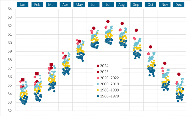
Figure 1 Details (click to view)
Each blue, yellow, and red circle represents the average global air temperature in a prior month between 1960 and 2022, black circles represent data for 2023, and black squares represent data for 2024. From June 2023 through March 2024, global air temperature has been at record-high levels.
It is worthwhile to briefly explain the seasonal cycle of global average temperature that is apparent in this graph. The seasonality may seem counterintuitive given that, on a global level, the earth receives about the same total amount of solar energy per day throughout the year. When the northern hemisphere experiences fall and winter, the southern hemisphere experiences spring and summer, and vice versa. Less daylight in one hemisphere is counterbalanced by more daylight in the opposing hemisphere. This suggests that the global average temperature should remain roughly constant from one month to the next. However, the northern hemisphere contains over two-thirds of the earth’s land mass, and, in general, land heats up more quickly than does water in response to a given influx of solar energy. Consequently, global average temperature carries a strong signature of the northern hemisphere’s seasonal temperature changes.
Figure 2
12-Month Trailing Average of Global Average Air Temperature (F)
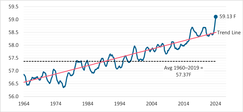
Figure 2 Details (click to view)
Across the most recent 12 months of data -- from April 2023 through March of 2024 -- the average global air temperature was 59.13F, which is a record-high measurement across a 12-month period, and is 1.76F greater than the 1960-to-2019 average of 57.37F.
Figure 3
12-Month Trailing Average of Global Air and Sea-Surface Temperature Anomalies (F)
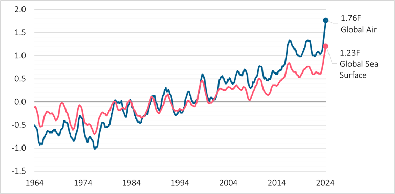
Figure 3 Details (click to view)
In the parlance of climate scientists, temperatures defined relative to their corresponding long-term averages are termed “temperature anomalies”. This graph presents both air temperature and sea-surface temperature anomalies. Each anomaly is defined as temperature averaged across a 12-month period minus the long-run average temperature computed across 1960 to 2019. Like the preceding graphs, this graph plots data through March of 2024. The anomalies on the far-right of the graph are computed across the 12-month period from April 2023 to March 2024, and are at record-high levels.
Figure 4
60-Month Trailing Average of Global Air and Sea-Surface Temperature Anomalies (F)
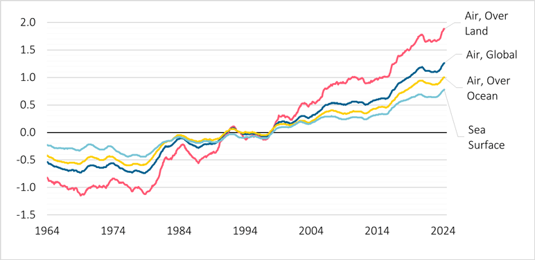
Figure 4 Details (click to view)
This graph resembles the preceding graph, but the anomalies are averaged across the trailing 60 months rather than 12 months. The longer averaging period provides a better view of long-term trends. In addition to global temperature computed across the entire surface of the earth, the graph shows air temperature averaged across all land areas and air temperature averaged across all oceans and other bodies of water. The results reveal that air temperature over land has risen at a significantly faster rate than air temperature over oceans, which, in turn, has risen at a faster rate than sea-surface temperature.
Figure 5
Estimated Warming Trend: Degrees (F) Increase Per Decade

Figure 5 Details (click to view)
While global warming rates can change across time, it is nevertheless useful to fit a linear regression to the data, thereby producing an estimated rate-of-warming that is constant across time. Regressions were run across two overlapping time periods: (1) 1960 to 2024 and (2) 2000 to 2024. The graph presents the best estimates for warming trends. “Air, Land” is air temperature averaged across all land areas, while “Air, Land N” and “Air, Land S” capture solely the land areas in the northern and southern hemispheres, respectively. “Air, Ocean” is air temperature across all bodies of water. “Sea surface” is the average water temperature across the surface of oceans and other bodies of water.
The regression results reveal the following:
- Global average air temperature over land is increasing at about twice the rate of air temperature over oceans, and at nearly three times the rate of sea-surface temperature.
- Average air temperature over land is increasing at a significantly faster rate in the northern hemisphere compared to the southern hemisphere.
- Warming rates estimated across the 2000-to-2024 period are significantly greater than those estimated across the 1960-2024 period, perhaps suggesting an acceleration of global warming.
Contact
If you have comments or questions, please send an email to research@soa.org.