 By Mary Pat Campbell
As actuaries, we work with data a lot, usually directly in computation. We often get a lot of training in regard to proper computational methods, especially relating to making actuarial estimates.
But we’re infrequently given training on data visualization. Often, we go with the approaches in the prior year’s report (if one exists) or use the default choices in Excel. Maybe tinker a little with the colors and the labels, but not much more.
In the following I will be looking at the importance of thinking more deeply about data visualization—perhaps thinking more deeply about that than explicit calculations—and how improving your data visualization approaches can make you more effective as an actuary.
Seeing is Understanding
Humans are very visual creatures. Even people who are blind have a grasp of spatial locations of entities. We are very good at gleaning quantitative patterns when we see them in graphical form, with quantities in relationship to each other, as opposed to looking at disembodied numbers on a page. People are very good at discerning visual patterns as well.
Given that, there are two main reasons for visualizing data:
- Analysis of data—see if patterns and relationships really are there, as opposed to being statistical artifacts, and
- Communicating results—show other people important information, to help them understand better.
In this piece, I am going to concentrate on the second goal. Let us suppose you already have the quantitative information you want to communicate to an audience.
- What kind of quantitative information are you trying to convey? A trend over time? Comparing differing amounts? Showing correlations? Other types of relationships?
- Is a graphical approach appropriate to communicate that information? Would something else work better?
- What type of graphic would best suit your purpose?
- Is there anything in your graphic that gets in the way of understanding?
I am not necessarily going to answer all of the questions in this article (nor necessarily thoroughly answer them in a later article), but I want to get you to think about how you communicate your numerical work.
Working through an example
I think the principles I have in mind will be best demonstrated by working through an example. The example I’m going to use in this article is going to be very simple, because I want to show how one should think about data visualization for communication even for the simplest displays. In general, simple is best—but that doesn’t mean you slap up the first graphical display you can think of.
I want to use an “infographic” I came across, promoting an upcoming theatrical production, “The Complete Deaths of William Shakespeare.”1 You can access the graphic by clicking on this link:(What is the teal wedge for? HOW DID THAT CHARACTER DIE?!?!?!)
The graphic can also be seen in the Telegraph UK article “Shakespeare’s 74 Death Scenes in a Single Play More Gory Than Game of Thrones,” Dec. 3, 2015.2
One actually needs the link to the original article for the embedded, interactive graph, because you can see that one of the labels, of a teal wedge, did not resolve in the graphic referred to above. To remove the confusion, I can reveal that one character’s death was due to a broken heart. I’m not sure if this is Lady Montague from Romeo and Juliet:
Romeo and Juliet
Act 5 Scene 33
MONTAGUE Alas, my liege, my wife is dead to-night;
Grief of my son's exile hath stopp'd her breath: 210
What further woe conspires against mine age?
or Enobarbus from Antony and Cleopatra:
Antony and Cleopatra
(Act IV, Scene 9)4
Domitius Enobarbus
O sovereign mistress of true melancholy,
The poisonous damp of night disponge upon me,
That life, a very rebel to my will,
May hang no longer on me: throw my heart
Against the flint and hardness of my fault:
Which, being dried with grief, will break to powder,
And finish all foul thoughts. O Antony,
Nobler than my revolt is infamous,
Forgive me in thine own particular;
But let the world rank me in register
A master-leaver and a fugitive:
O Antony! O Antony!
[Dies]
Wait, maybe her cause of death is grief, and his is shame … which leaves the unknown death-by-broken-heart character.
I need references.
Problems with a Silly Graph
Yes, I know this is a very silly graph (as Camelot is a silly place), but some of the issues with bad data visualization are easier to see when you’re looking at silly examples.
Too often, if we look at bad graphs based on real and serious data, you can see what is there even when the graphical representation is screwed up. I think this is why so many of us use less-than-good graphs; we can still see the meaning even though there is so much to be improved.
Let’s go through my questions and apply them to Figure 1.
- What kind of quantitative information are you trying to convey? A trend over time? Comparing differing amounts? Showing correlations? Other types of relationships?
- Is a graphical approach appropriate to communicate that information? Would something else work better?
- What type of graphic would best suit your purpose?
- Is there anything in your graphic that gets in the way of understanding?
I believe the intended message is how gory Shakespeare’s plays are, but it’s difficult for me to get at with this graphical representation. Pie charts represent only percentages, not absolute amounts.
Indeed, one reaction piece objected to the gory-Shakespeare production, arguing that
“The strength of Shakespeare and Dickens lies in their sheer bigness: the volume of their output, the size of their imaginations, the endless pleasure they provide. Cutting and pasting great works is like being shown a pebble and told it is a cliff.”5
The author of the rebuttal notes that there are only 74 deaths across 37 plays … and, of course, in some plays nobody dies at all! Merely showing that a good percentage of the deaths in Shakespearean plays are due to stabbings does not help us much.
One of the big problems with this pie chart is it has way too many categories. And then you don’t see the characters or plays being referenced—that’s way too much categorical data to be represented in a graph.
For an example of tabular information, check out this table from a research paper on deaths, faints, or fits due to extreme emotion:6
| Play or poem and reference* | Character dying | Emotion and its cause |
| Love's Labour's Lost 5.2.14 | Catherine's sister | Grief at unrequited love |
| Romeo and Juliet 5.3.209 | Montague's wife | Grief at her son Romeo's banishment |
| Othello 5.2.212 | Brabantio | Grief at his daughter marrying Othello the Moor |
| King Lear 5.3.195 | Gloucester | Mixed grief at his blindness and joy at being reunited with his son Edgar |
| King Lear 5.3.309 | Lear | Mixed grief at Cordelia's murder and hope that she might still be alive |
| Antony and Cleopatra 4.10.22 | Enobarbus | Grief and shame at his desertion of Antony |
| Antony and Cleopatra 5.2.283 | Iras | Grief at Cleopatra's imminent suicide |
| The Winter's Tale 3.2.142 | Mamillius (child)
|
Grief at his mother Hermione's unjust imprisonment |
| Cymbeline 1.1.37 | Posthumus' father | Grief at death of two sons in battle |
| Cymbeline 5.6.26,57 | Queen | Grief at her son's mysterious disappearance and despair at her own homicidal wickedness |
These are 10 deaths, supposedly due to grief. Note that this researcher makes a stronger case than the pie chart, in terms of grief at least, because you can look up the reference and see if the character really died of grief. I am starting to doubt the accuracy of Figure 1.
With 74 total deaths, a table may be extreme. But it is good to note what information you’re obliterating when you make a graph. The whole point of data visualization is generally a simplification of one’s data set so that it’s easier to understand.
However, when one simplifies so much that useful information is lost, one is just putting a meaningless picture up. This was often the criticism of USA Today infographics in its early days—overly simplified data in overly gussied-up graphics.
I will argue below that there are several graphical choices that are better than pie charts. We’ll come back to this point later.
There are so many elements of the original graph that get in the way of understanding. I will point out a few of them.
- Labels of wedges are far from the wedges. You have to trace back the lines, at which point you may have forgotten what you’re looking at.
- Way too many wedges. Why not consolidate?
- No ordering of wedges. It is difficult to compare the beheaded vs. poisoned wedges.
- We have no idea how many deaths in total there are in looking at the chart.
And then if one wants to consider the bloodiness of Shakespeare, I would want to know how many of the deaths are historical deaths vs. fictional. If you’re doing a play about Richard III, you are going to include the very real fact that he was killed in battle. Even some of the plays categorized as tragedies, like “Julius Caesar,” are based on historical events. Julius Caesar was not going to leave the play unstabbed. Shakespeare could take only so many liberties in the historical plays.
Contrast that to Titus Andronicus, which has 14 deaths (including a rape, cannibalism, and a tongue being ripped out), a choice made by Shakespeare as it is a purely fictional tale.7 I hope.
A much better graphic of Shakespearean deaths can be seen here: (I am not including it directly due to copyright concerns.) The graphic covers only the tragedies (and a bonus death from “A Winter’s Tale,” which is an … odd play; one character exits, presumably to his death, pursued by a bear). But 64 of the 74 deaths are shown, graphically. Here is my extract of 63 of the deaths, listed by play (as not all the deaths from “A Winter’s Tale” are shown.)
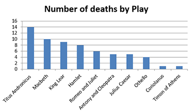
Notice I did not make this a pie chart. Also, I sorted the plays by numbers of death, not publication date (which gives no great trend in any case.)
Why Pie Charts Are Awful
Let’s step back a moment and list the general problems with pie charts:
- They are only good at distinguishing between orders of magnitude differences.
- When quantities are similar amounts, it is very difficult to see which is larger, especially if they are physically separated.
- If you have more than one pie chart, it’s extremely difficult to compare amounts changing between the two.
- The more segments there are, the more difficult it is to make any kind of comparisons.
- We don’t know how much the total “pie” represents.
Now, we could fix some of these problems by labeling the slices with the numbers they represent. But at that point, you may as well make a table.
Alternative to Pie Charts
There is rarely a good reason to use pie charts for the reasons given above. They’re awful for most of the uses we want to visualize data: showing trends, relationships, significance. If a single item dominates, I suppose that a pie chart would help show that. But I wouldn’t use a pie chart, even so, when there are so many better choices.
Imagine me as Faye Dunaway in “Mommie Dearest” screaming “NO PIE CHARTS!!!! EVER!!!!” at you while whacking you over the head with a text by Edward Tufte. (I will write about Tufte in a later article)
That may get you out of the habit.
Below are some choices that could have been made in lieu of the pie chart, without requiring further numbers.
Make a Table
Remember my second question at the beginning of the article:
2. Is a graphical approach appropriate to communicate that information? Would something else work better?
Sometimes, there are so few numbers, there’s really no good reason to graph them. People often make pie charts because there are only five numbers to look at. Five quantities is about as much as pie charts can handle, so why not?
Because pie charts are awful at communicating numbers, that’s why.
Why not just list the actual numbers in a table?
If you have only a few numbers to compare, consider just putting them together in a table, as I showed above with deaths from grief.
When to Use a Table
As fun as graphs are, sometimes tables are preferable.
Consider using a table instead of a graph if:
- There are only a few numbers to compare;
- People need to look up exact amounts, instead of making a comparison (as with a rate table);
- You are looking at a single slice in time, so do not need to see a trend; and
- You want to include categorical information.
Choice of Graphs
In the following, I will be considering answering the question:
3. What type of graphic would best suit your purpose?
Different kinds of graphs emphasize different aspects of the data.
I am going to stop using the Shakespearean data set for the following, because it’s not a particularly numerically rich set, and start using a serious data set that tracks the value of crops harvested in the world. The data are from the Food and Agricultural Organization of the United Nations, Statistics Division, or FAOSTAT. The data can be found here:
I originally extracted the data in July 2015, and the data ran through 2012 at that time.
Here was my original pie chart of crop values:
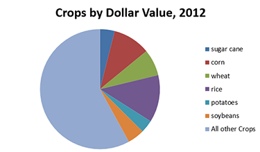
Figure 1a: Top six crops and all other crops
For the following, I am going to take the data underlying this pie chart and run it through different graphical choices.
Column Graph with Sorted Categories
One easy-to-implement replacement of a pie chart is a column or bar graph, with the amounts properly ordered in ascending or descending order.
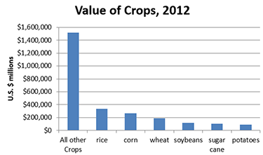
Figure 1b: Now we can compare
Now we can easily eyeball the differences.
Both tables and graphs used for comparison should be put in a proper order. It is very easy to visually compare against neighboring information, versus that which is farther away. Sorted data are easier to interpret, whether in graphical or tabular form.
Stacked Graphs to Show Changes over Time
The crop value data set actually has more than just information for 2012. There are data for the value in current U.S. $ (in millions) going back to 1991.
This is where graphs really can add value by making it easy to look at a large quantity of data and make sense of trends.
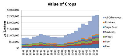
Figure 5a: Absolute Stacked Column Graph, No Gap between Columns
This kind of graph shows the growth of the total value of crops, as well as the composition. The main feature one notices is the overall growth of crop value, and not so much the individual pieces (though they are there). One can get an idea of how each piece is growing, but unless there are large differences, one may not notice the compositional change.
If one cares about how the percentage composition has changed, one can use a percentage stacked column graph to see it better:
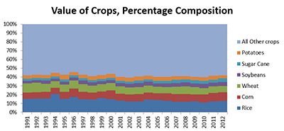
Figure 5b: Percentage Stacked Column Graph, No Gap between Columns
For both of these column graphs, I removed gaps between the columns so that I did not have a broken visual landscape. I could also have done area graphs, but I find those to be deceptive sometimes in that it’s not clear what the sampling period of your data are.
With these column graphs, it’s clear the data are annual.
Again, it is a little difficult to see the movements of the percentages. There seems to be some fluctuation, and one would have to be concentrating very carefully to see that the wheat portion is shrinking, and that rice has been a smaller percentage over time, though it still is the largest percentage of any single crop.
Line Graph to Compare Trends
With either version of the column graph, though we can see the full column growing over time, or the percentages fluctuating, if I wanted to easily compare the trajectory of the top six crops, I would do a line graph.
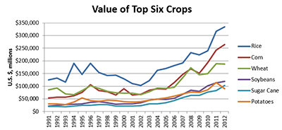
Figure 5c: Line Graph to Compare Individual Trends
We can see that there is almost a parallel trajectory for crop values, but notice that wheat has stalled and corn has taken off since 2009.
The single-year snapshot we showed before would not have uncovered this trend, and the stacked columns make it difficult to see these relatively small variations.
In this case, we’re using a graph to do some data analysis. I didn’t “see” the disparity in wheat and corn with the other graph choices. I can literally see the trends much easier in a graph than if I had done statistical analyses.
How to Choose Graph Type
Let us return to the key question:
3. What type of graphic would best suit your purpose?
The different graph types have helped us do different things.
- Column graph: compares importance of each crop type for a single year.
- Stacked column graph: shows growth in total crop value over time, with some indication of composition.
- Percentage column graph: shows how composition of crop value has changed over time, but not total growth.
- Line graph: compares growth trends for different crops, helped point out divergence for corn and wheat.
Each of these has a context where these would be the best choice. Sometimes you do not know which is the best choice unless you try a variety of visualizations and find the one most effective in telling the story you have to tell.
Why are we doing this?
Going through graph choices for crop values probably seemed like a lot of work for such a simple data set, and my critique of the Shakespearean deaths pie chart may have seemed overkill (=cough=). After all, a lot of the data we look at as actuaries are much more complicated, with multiple dimensions.
I picked some very simple data to show how we convey information about that data is important.
One of the things actuaries get criticized for, as a profession, is our communication abilities.
I don’t think it’s because we have smaller vocabularies or don’t understand grammar or style. Indeed, the biggest sticklers I’ve seen with regard to prescriptive grammar have been actuaries. (Well, actually, professional editors, but most people don’t have as many editorial friends as I do.)
I think we’re criticized as being poor communicators because we often fall flat when it comes to communicating numbers. We are often not effective in telling a story through numbers. Many people have difficulty juggling many numbers at once and need more context and interpretation … but mainly they need to see what you’re talking about if you keep your communications in words.
I believe we throw out?? too many numbers without context, going with default choices for displaying information. I have tried reading a variety of reports, but sometimes gotten lost in a miasma of numbers, as I cannot see relationships between quantities. I have copied other people’s information from tables and put them into graphs so I could actually see the trends, and then I understood the dynamics much better.
Effective graphs are very important in communicating numerical information as well as analyzing it.
As can be seen above, the conclusions you get from data can be highly dependent on their presentation. We noticed different features of the data depending on whether we had made a pie chart (DON’T DO IT), column graph, stacked column over time, or line graph over time, as well as what I chose to include or not to include.
Effective graphs can be extremely powerful when you have a strong numerical tale to tell. It can also help you show when there’s really nothing significant there, though statistics may be saying “it’s significant!” Graphs can help our numerical judgment and provide context to how pieces interrelate.
Coming attractions
This is the first article in a series on data visualization:
- The Why of data visualization—questions to ask when visualizing numerical information.
- The Who of data visualization—major figures and books in advocating data visualization best practices.
- The Where of data visualization—websites to polish your data visualization game.
- The What of data visualization—software to implement data visualization.
- The How of data visualization—specific data visualization techniques to consider in actuarial practice.
You may have noticed I did not include “The When of Data Visualization” in my list because that article would have been a single word:
NOW
What are you waiting for?
Mary Pat Campbell, FSA, MAAA, is a vice president, Insurance Research at Conning in Hartford, Conn. She can be reached at marypat.campbell@gmail.com .
1 The Complete Deaths webpage. http://www.spymonkey.co.uk/the-complete-deaths.html. Accessed January 2016. Premiere to be at Brighton Festival in May 2016.
2 http://www.telegraph.co.uk/theatre/what-to-see/shakespeares-74-death-scenes-in-a-single-play-more-gory-than-gam/. Accessed January 2016.
3 http://www.shakespeare-online.com/plays/romeo_5_3.html. Accessed January 2016.
4 http://www.shakespeare-online.com/plays/antony_4_9.html Accessed January 2016.5 Wilson, Frances. “Shakespeare doesn’t deserve this monstering.” The Telegraph. Dec. 3, 2015. http://www.telegraph.co.uk/culture/film/12032270/Shakespeare-doesnt-deserve-this-monstering.html Accessed January 2016.
6 Heaton, Kenneth W. “Faints, fits, and fatalities from emotion in Shakespeare's characters: survey of the canon.” BMJ 2006; 333 doi: http://dx.doi.org/10.1136/bmj.39045.690556.AE (Published Dec. 21, 2006) http://www.ncbi.nlm.nih.gov/pmc/articles/PMC1761160/ Accessed January 2016.
7 Furness, Hannah. “Globe audience daints at ‘grotesquely violent’ Titus Andronicus.” The Telegraph, April 30, 2014. http://www.telegraph.co.uk/culture/theatre/william-shakespeare/10798599/Globe-audience-faints-at-grotesquely-violent-Titus-Andronicus.html Accessed January 2016.