By Mark Spong
The insights visuals can provide always amaze me. I’ve found the ones I like best tell a story that lends itself to analysis rather than showcasing the results. The audience gets engaged and is drawn to conclusions that lead directly to actions or drive decisions. This approach can be powerful.
As actuaries, we may not have the time or expertise to fine-tune visuals to perfection. However, a little innovation and creativity can go a long way. The goal for this article is to highlight a few examples of interesting visuals I’ve used in my career to show just how often and varied they can be. Hopefully, this will push your thinking about how you can use more visuals in your work.
Example 1: Variable Width Bar Chart
Before I was an actuary I was a teacher, and I was hooked on the idea of data-driven instruction. I used an online multiple choice testing tool called Daskala (doesn’t seem to exist anymore) that produced the following graphic:
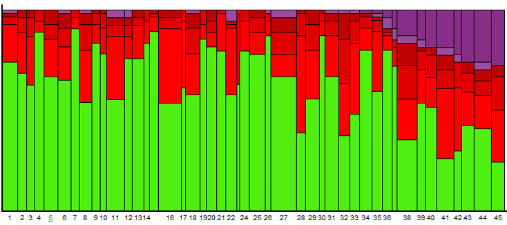
As bad as multiple choice tests are for assessing mastery of a concept, this view of results was extraordinarily powerful.
- Correct answers are in green, and height represents percentage of the class who answered correctly.
- Incorrect answers are in shades of red, and the height of different shades indicates percentage of the class who chose that incorrect response.
- Questions that were never answered or never viewed are in shades of purple.
- The width of each column represents the average amount of time spent viewing a question.
As a teacher I could read this graphic and use a click-and-drill-down interface to analyze the results of this test and tailor my follow-up instruction to address patterns. Here are some of my conclusions:
- Question 16 appears to have a very popular incorrect answer and took students a long time on average to submit an answer. I should see what was so tricky about this question.
- The purple section tells me a sizable fraction of the class ran out of time
- A subtle declining trend in green helped me realize that my students struggled with endurance and maintaining concentration throughout the exam.
Example 2: Sankey Diagram
I’ve recently stepped up to be the MassMutual Actuarial Leadership Development Program recruiting manager. In order to have a clear vision of our pipeline I put together a modified version of the following Sankey diagram (source: sankeymatic.com).
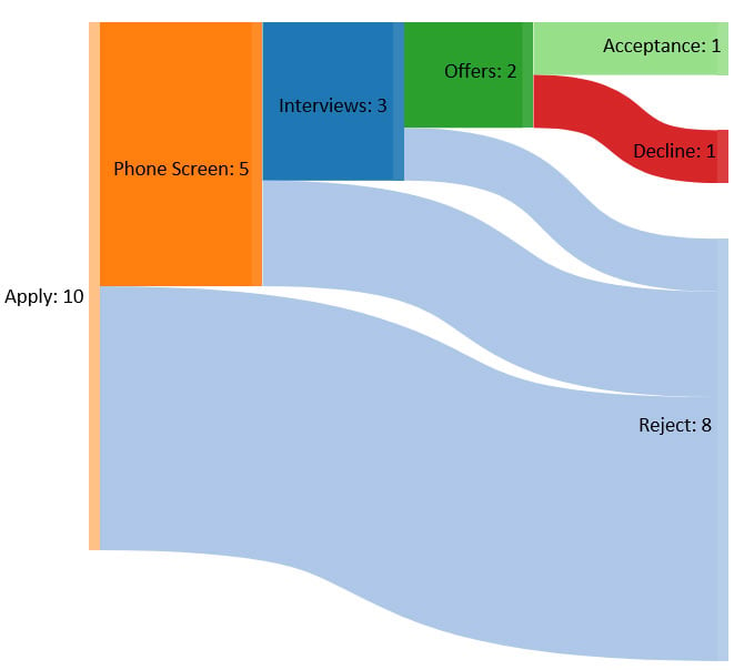 Data Values and Interpretation:
Of [10] applicants: [5] had phone screens, [5] were rejected
Of [5] phone screens: [3] had interviews, [2] were rejected
Of [3] interviews: [2] received offers, [1] was rejected
Of [2] offers: [1] accepted, [1] declined
The visual demonstrates where in the recruiting process we narrow the pool and leads to discussions about the efficiency of our process, quality of the talent, and diversity at the different stages in recruiting. The result is a more deliberate, controlled and fair process.
Example 3: Stacked Area Chart for Demand Capacity Analysis
When we are asked to take on another project or assignment our response is too often based on how busy we feel today. I’ve found that by projecting my time commitments into the future I am in much greater control of my productivity.
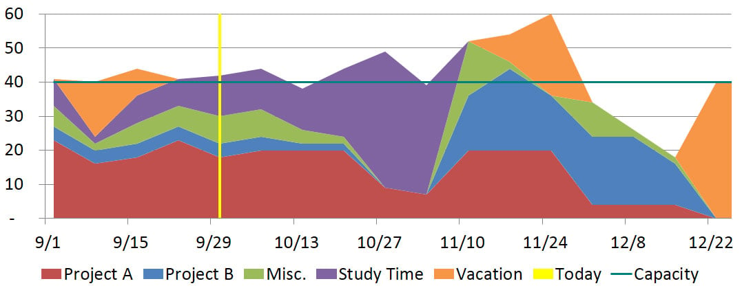
Benefits:
- Identify areas where I’ll need to do some load balancing with my team or push deadlines with plenty of advance notice
- Helps me think of my time as a limited resource that I can spend moving projects forward with urgency
- Tracking my actual time spent gives me a chance to reflect and improve my efficiency and estimating skills.
Example 4: SIPOC Chart for Process Governance
I started using Microsoft Visio for process diagrams heavily when I worked on the Actuarial and Investments team within our Internal Audit Department. The following diagram identifies the suppliers, inputs, processes , outputs and customers (SIPOC) as well as key control procedures 1–5.
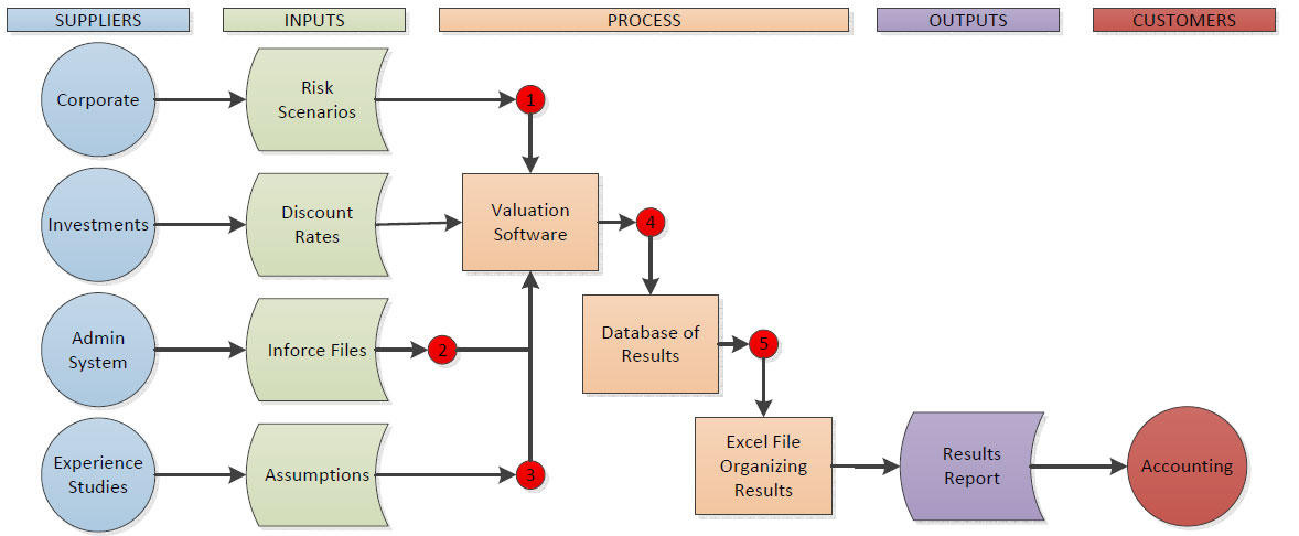
Source: Modified SIPOC example based on SOA Model Validation Webinar on June 23, 2015 by Jim McClure
At the time I was still in my first few years in the actuarial profession and a novice in many of the actuarial functions we audited, so this was a critical activity that enabled me to understand how an area worked. This sort of image acts as powerful and succinct documentation and enables users to figure out ways to improve their process over time.
Example 5: Heat Maps for Mortality Improvement
The MP-2017 Mortality Improvement Scale that was published in October 2017 contained a heat map (Figure 1) that showed the age, year and cohort effects (pg. 33).
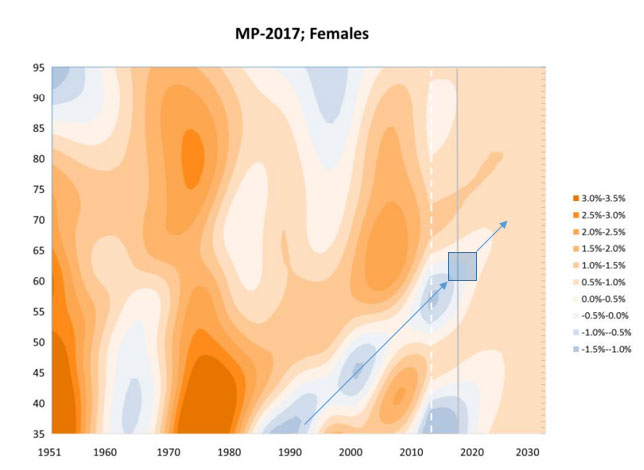
Cohorts can be identified by upward-sloping lines. The current cohort of female near-retirees (identified on graph with blue line) has experienced significant mortality deterioration over the years and contrasts sharply with the mortality improvement characteristics of the previous generation (vertically shift blue line belonging to current generation upward to get previous generation and you’ll notice the change in color). This cohort view is critical for setting forward-looking assumptions and understanding intergenerational patterns.
Conclusion
I’ve presented five examples of visualizing different types of information and the stories they each tell. I’ve deliberately stayed away from the basic charts that you’ve probably seen before and instead focused on designs that are a bit more unusual. For those interested in diving deeper, I’d recommend reading Edward Tufte’s book The Visual Display of Quantitative Information. That book sets the bar quite high for aesthetics but also includes some great ideas and guidance about how to take full advantage of how innovative visuals can be.
Mark Spong, FSA, CERA, MAAA, is an actuary and Actuarial Leadership Development Program recruiting manager at MassMutual in Springfield, Mass. His current role is in reinsurance and product oversight, where he partners with actuarial functions across the company. He can be reached at markspong@gmail.com.