By Mary Pat Campbell
This is a third part of a continuing series on data visualization (aka dataviz):
- The Why of Data Visualization—questions to ask when visualizing numerical information
- The Who of Data Visualization—major figures and books in advocating data visualization best practices
- The Where of Data Visualization—websites to polish your data visualization game
- The What of Data Visualization—software to implement data visualization
- The How of Data Visualization—specific data visualization techniques to consider in actuarial practice
(The when of data visualization being NOW, of course.)
For this article, I’m going to concentrate on websites (that I did not touch on before) that can help you improve your approaches to data visualization. I linked to several websites from notable people in the dataviz community in the second of this five-part series, The Who of Data Visualization, so you should check those out as well.
The places I am concentrating on are more to provide inspiration for different dataviz approaches to take, and exploring what can be done. I will be looking at specific software and techniques in future articles.
Reddit is a discussion forum, broken up into “subreddits,” which each focus on specific topics or themes. People submit items such as links to other sites, pictures, or just simple text. Importantly, users can vote these posts up or down, giving other users an idea of what is worthwhile to look at. Each subreddit has its own rules and standards.
There are a series of subreddits that can help inspire you to make beautiful graphs … and also avoid making ugly ones. There is one subreddit in particular that is most useful for the dataviz practitioner, which I discuss below.
Data is Beautiful
https://www.reddit.com/r/dataisbeautiful
The point of this subreddit is focusing on visualizations that are effective, and making sure the original source of data and creator of the visualization are identified and linked. Not all subreddits have this rule.
Submissions tagged with [OC] (for original creator) indicate the submitter created the visualization themselves. The requirement is that at least the data source and tool used to create the visualization is identified.
The most popular submissions in this subreddit include not only compelling visualizations, but usually links to both the underlying data (or model) and code for other people to look at and play with.
One of the best things to do in getting started in more complicated data visualizations is to build on completed projects of other people. Perhaps you can change a parameter or two, and watch the effects. Maybe you can import a different data set to see what the code does.
Something that can be helpful is to check out the top submissions to see which have had the most up-votes:
https://www.reddit.com/r/dataisbeautiful/top/
They’ve also given out awards for the best visualizations in particular time periods. One of my favorite awarded visualizations is the evolution of Reddit from 2006 to 2012: http://imgur.com/a/DNqtI
Data is Beautiful is a very active subreddit, with more than 7 million subscribers. And as I write, I see 1,500 people actively on the subreddit, perhaps voting on submissions, making their own submissions, or participating in comments.
The following are related subreddits, but are much less active:
- Visualization—more for discussing topics, developing ideas, etc.: https://www.reddit.com/r/visualization
- Mapporn—for map-related visualization: https://www.reddit.com/r/mapporn
- Infographics – less data and more visual: https://www.reddit.com/r/Infographics
- DataVizRequests—get help in getting visualizations! (this is not an active subreddit): https://www.reddit.com/r/DataVizRequests
- Data is Ugly—horrid examples of visualizations, especially if misleading, confusing, or just plain bad: https://www.reddit.com/r/dataisugly
You may think the last subreddit is not exactly what you want to look at in improving your dataviz skills, but wait until the end of this article to see how bad visualizations can help you improve.
World Data to Determine Historical Trends
Gapminder: https://www.gapminder.org/
Our World in Data: https://ourworldindata.org/
World Bank Data: http://data.worldbank.org/
One of the most important aspects of learning data visualizations is having data to play with. Unfortunately, much of the data we work with in our own companies or with clients are necessarily proprietary. This makes it difficult for actuaries to share graphs or data sets to interact with.
The three sites I list above, though, are using open, mainly governmental data sets.
Gapminder is a project of Hans Rosling, a professor at the Karolinska Institute in Sweden. Rosling’s expertise is in global health, and he focuses in particular on the interaction between poverty and health. Rosling has been a frequent speaker at TED, and his many TED Talks can be found here: https://www.ted.com/speakers/hans_rosling
Gapminder has a core visualization, a bubble graph, which plots variables by country over time. The bubble graph page is here: https://www.gapminder.org/tools/bubbles, with color of the bubble indicating continent, size of the bubble indicating population size, horizontal axis is log scale of per capita income and the vertical scale is life expectancy from birth. In the background is the year in large font, and one can play an animation watching the improvement of world fortunes over 200 years. You can see the bubbles dip with the Spanish Flu outbreak in 1918, the various dips from wars, and the increasing income and life expectancy throughout the world.
You can grab your own data from Gapminder here: https://www.gapminder.org/data/
Watch Rosling’s TED talk on an earlier version of the bubble graph
Our World in Data is a project of Max Roser, with more developed narrative around specific themes. Roser intersperses his visualizations with commentary, though sometimes it is just base visualizations. As an example, check out this page on child mortality: https://ourworldindata.org/child-mortality/. Roser uses multiple datasets, but each of his graphs, he provides the sources, and you can download the data directly to try your own graphs.
I grabbed data from both Gapminder and Our World in Data to do my own analysis of improvement of child mortality in the U.S. at my blog: http://stump.marypat.org/article/476/good-news-of-wednesday-the-world-is-getting-better—and in making my own analyses, I found some significant improvements, and in one case, a disimprovement that I ultimately tied to diphtheria.
Obviously, there are political thrusts to both Gapminder and Our World in Data. If you find that off-putting, you can simply go to the World Bank Open Data project. The databank is here: http://databank.worldbank.org/data/home.aspxand you can pick the databases, indicators, countries, and regions you want and create and save data extracts. Dig into the data catalog here: http://datacatalog.worldbank.org/
Kaggle
Datasets: https://www.kaggle.com/datasets
Visualization Kernels: https://www.kaggle.com/kernels?outputType=Visualization
Kaggle is best known for its predictive analytics/data crunching competitions, but a few parts of the site aren’t directly tied to competitions. There are datasets and kernels.
The datasets are somewhat random. As I look at the site currently, the top dataset is on irises (as in, the flowering plant) where the challenge is to split the set into three species. Other popular data sets are European soccer statistics, deaths and battles in the fantasy HBO (and book) series Game of Thrones, and U.S. Baby Names.
But let’s look at a dataset uploaded by the Centers for Disease Control and Prevention: Death in the United States (2014). https://www.kaggle.com/cdc/mortality
In a dataset page, you see kernels which involve the code being run on the data set (and one can “fork” a kernel—which means you make a copy of the work, code and all, and then you can make your own changes without affecting the original kernel. Take a look at this kernel, using R, investigating suicides in 2014 in the U.S.: https://www.kaggle.com/omaymas/d/cdc/mortality/us-suicide-cases-in-2014/notebook—this is landing you on the “report” page, where the person steps through the code, shows their graphs, and remarks on the work.
What’s nice about this is you can check out prior versions, discussions on the work, and even forks people have made. Checking out the forks here: https://www.kaggle.com/omaymas/d/cdc/mortality/us-suicide-cases-in-2014/run/201311/forks?outputType=Visualization—you can see that one person deleted a bunch of the code so that there was only one graph as output (as opposed to six).
Visualizations from News Sites: Bloomberg and Financial Times
Back in April 2014, I noticed the following piece at Bloomberg: “How Americans Die,” http://www.bloomberg.com/graphics/dataview/how-americans-die/
I think it was an excellent visualization of long-term mortality trends in the United States. My main issue with the visualizations is the color choice—colors for the graphs seem to have been chosen for the purposes of looking pretty, and not so much in being able to tell which data series you were looking at. That said, the data tell a story, and the interactive nature made it easy to find the values behind specific data points, or to focus on a particular data set.
The creator of the piece, Matthew C. Klein, left Bloomberg in August 2014 and joined another publication, known for graphics: Financial Times and FT Alphaville blog. Klein seems to favor heavily-data-dependent analyses and often has graphs in his posts at FT Alphaville. Klein’s topics are finance-related, and will be likely of some interest to actuaries. The graphs aren’t overly complicated, and are obviously designed to tell the story and help analysis, the two main purposes of data visualization, as I noted in my first article in this series, “The Why of Data Visualization.”
As noted, the Financial Times are known for their graphics, and the page “The Chart Doctor” covers important topics in designing graphs. For example, in May 2016, Alan Smith and Federica Cocco published, “When dense makes sense: explaining complex data in charts”: https://www.ft.com/content/96566916-1852-11e6-b197-a4af20d5575e—and showed an example of how they attempted to visualize a proposed change to junior doctor contracts in the U.K. This was a heated debate in the U.K. at the time, but as there were many parts to competing proposals, it was difficult for the general public to make comparisons. The original chart was in one structure, but involved a bunch of repetitions and lacked markings of specific times; the second, updated chart removed the repetitions, put in detail of the times at which increased pay kicked in, and allowed for comparisons between competing proposals.
As the authors noted, reader reaction was that the chart helped many for the first time understand what the distinctions between two proposals were. Imagine putting together your next chart for key stakeholders, and your chart is what drives them to understand an issue, and be able to make a decision based on that.
Links to check out:
BloombergGraphics: http://www.bloomberg.com/graphics
Bloomberg Visual Data (some regularly update): http://www.bloomberg.com/graphics/infographics/
Financial Times, “The Chart Doctor”: http://www.ft.com/chart-doctor
Matthew C. Klein: http://ftalphaville.ft.com/meet-the-team/matthew-c-klein/
A Blog of Bad Visualizations
Link: http://viz.wtf/
This is kind of an anti-inspirational site, filled with examples of visualizations that make one’s chin drop and one’s eyes wince in pain. This is a tumblr, so individual posts are usually a key graphic and a link to the original source (so you know just whom to blame for the excrescences). There will be tags on the bottom of the post, so you can check out, say, all the bad pie chart visualizations: http://viz.wtf/tagged/PieChart
[MPC’s eyelids are twitching at this point … You think this one has enough slices in the pie? http://viz.wtf/image/146561867336]
Some (or perhaps most) are just poor infographics, with a bunch of disconnected facts, such as this “Things that Happen on Internet Every 60 Seconds” visualization: http://visual.ly/things-happen-internet-every-60-seconds. I believe that infographic was intended to promote the creator.
This one is not so bad, promoting the use of blue in websites and logos: http://visual.ly/coolness-blue-web-design(know of any blue logos? Visualize me arching my eyebrows upwards and gesturing with my eyes to look at the top of this article)—the poor visualization is the horrid 3D pie chart which doesn’t seem to have anything to do with anything … not to mention that some of the items are in green and purple. Sure, they don’t clash with blue, but it kind of doesn’t fit with the theme.
Okay, that’s enough beating up on the horror that is pie charts. Let’s look at some graphs with a more actuarial flavor.
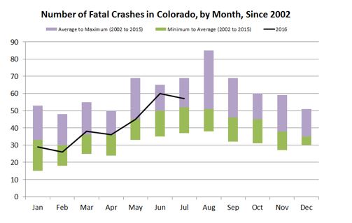
Here is a graph about the number of fatal car crashes in Colorado by month: http://viz.wtf/post/148698598820/cited#notes
There are many things wrong with that graph. The core problem seems to be that it’s confusing to look at. But its major fault is the secondary vertical axis to plot the number of fatal crashes in 2016. If one wants to tell the story that there are fewer crashes in 2016 than the average seen since 2002, then how it looks visually is not good.
I have fixed the graph using the original data (as of Aug. 8, 2016), just using Excel. The data were retrieved from here: https://www.codot.gov/library/traffic/safety-crash-data/fatal-crash-data-city-county. Another example of poor visualizations, look at what they did with fatal accident statistics by city and county: https://www.codot.gov/library/traffic/safety-crash-data/fatal-crash-data-city-county/fatal-crashes-by-city-and-county—just let us download your spreadsheets, already!
Did MPC create this chart? If not, it needs to be sourced. Perhaps permission to use?
Yes, I should really be looking at the number of fatalities compared to the population or person-miles, but let’s just keep using the absolute number of crashes for now. By making the minimum/average/max with stacked columns, I have a visual range you can compare 2016 against. In this case, we can see that from January to May 2016, the number of fatal crashes has been about average compared to history, and that the number of crashes was a little elevated in June and July compared to the average. I don’t particularly care which years provided the minimum or maximum number of crashes, but if I did, I could put that back in as data labels.
The prior graph made you have to work to be able to interpret. The sign of a good visualization is that one can just see the important aspects.
So you see, you can get inspirations from bad visualizations as well—taking a bad visualization of a good data set and then fixing the glaring problems is a good habit to get into … because that’s something you may be able to apply to your own work.
Got any sites to recommend?
The sites I link to are as-of a specific moment in time. Websites can die and new ones pop up and flourish. Have any you’ve seen recently and would like to share? Please email me at marypat.campbell@gmail.com.
Mary Pat Campbell, FSA, MAAA, is a vice president, Insurance Research at Conning in Hartford, Conn. She can be reached at marypat.campbell@gmail.com.