by Andrew Chan
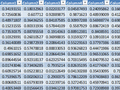
 We create a lot of financial reports, and at the same time we probably receive even more financial reports. Most financial reports are full of numbers like the following one. As a result, readers must look hard for the information that they want, e.g., in the following control report, readers would have a hard time seeing if a certain ratio is bigger than 0.9.
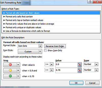
Excel 2010 offers Conditional Formatting, which allows us to add additional business context around our regular reports. Let's add some color icons next to the boring numbers.
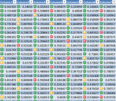
We now have a report that actually highlights items that are critical to our business.
Let's look at another example, a report where we want to compare 12-month averages.
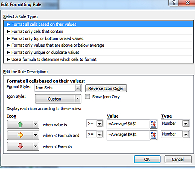
The report contains the same numbers, but now we are looking from another angle.
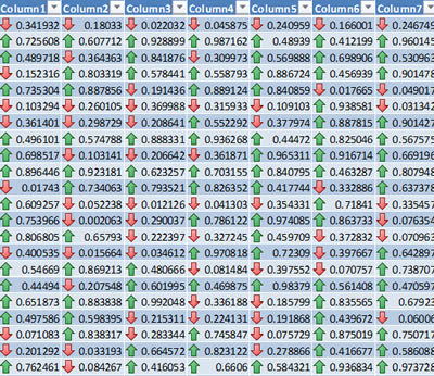
Some may want to see more detail; so instead of just showing a simple arrow, we can use Sparkline to display the trend of the last 12-month values and even where the max/min are.
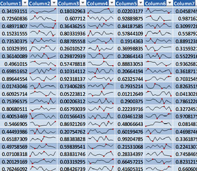
I can't make my reports dance, but Excel 2010 can give new life to otherwise boring financial reports. And there are many professional data visualization tools that can make information jump out from our reports, e.g., Qlikview, Spotfire, Tableau and don't forget to try out PowerPivot.What tools are you using now?
Andrew Chan, ASA, is a financial model engineer with ALG Consulting. He can be contacted at chan_a@algconsultings.com.