Visualizations of COVID-19 Case and Death Counts
Summary
This web page provides links to online graphs and maps, developed by the Society of Actuaries (SOA), of COVID-19 case and death data. The exhibits provide three levels of geographic summarization: worldwide data by country, United States data by state, and United States data by county. The SOA updates these online exhibits on a weekly basis (every Monday morning) with the latest data downloaded from the Johns Hopkins University's (JHU) coronavirus database.
Excel Data Files
Database of COVID Case and Death Counts
Data Visualizations
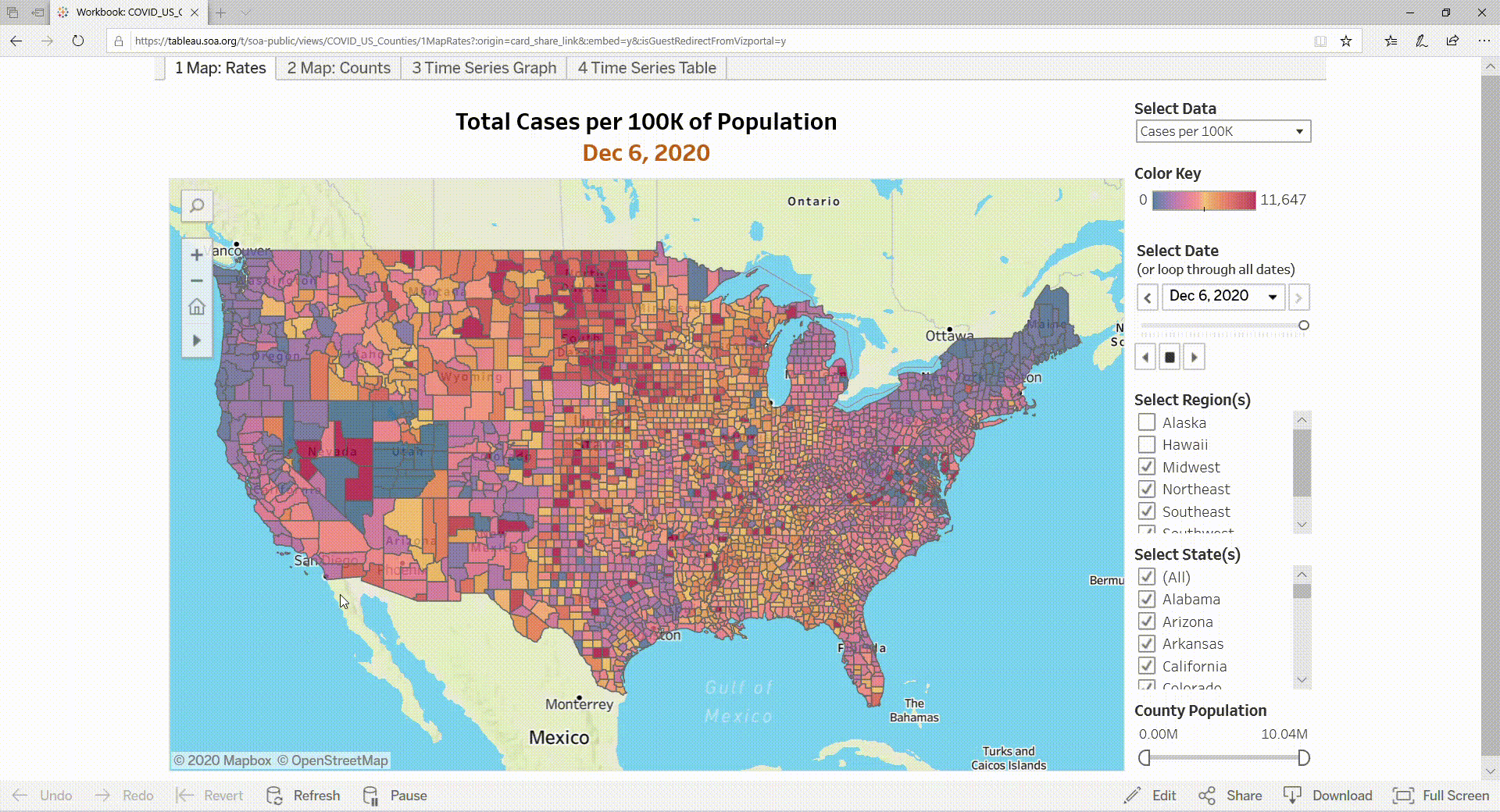
These interactive dashboards are visualizations of key metrics found in the report. They provide filtering, drill-down, and other interactive capabilities that allow you to focus on specific subsets of the data.
Visualizations for U.S. Counties
Questions or Comments
If you have comments or questions, please email research@soa.org