When Affordability Savings Do Not Reduce Costs
By Tony Pistilli
Health Watch, December 2020

“Sophomore slump,” “Sports Illustrated cover jinx,” “Plexiglass principle”—sports lore has long spoken of a mysterious force that causes players at the height of their game to inexplicably perform worse when accolades come their way. This “mysterious force” is not mysterious at all; it is a manifestation of a statistical phenomenon called regression to the mean. Understanding regression to the mean can benefit your fantasy team and next year’s pricing.
INTRODUCTION TO REGRESSION TO THE MEAN
Regression to the mean is a phenomenon that arises when comparing sequential data points. It states that when an initial observation is extreme or an outlier, future observations will be closer to the average.
Underlying the phenomenon is the observation that extreme occurrences are the product of both signal and noise or randomness. Illustratively, a good home-run hitter can reliably hit 45 balls out of the park in a season, compared to an average batter’s 15. There is a meaningful and persistent gap in those players’ abilities that can be labeled “signal.” Good home-run hitters sometimes hit 65-plus homers in a season, which lands them a spot on the record charts. The “sometimes” in that last sentence is good fortune that is, in a sense, random.
After Barry Bonds hit a record 73 home runs in 2001, he hit 46 in 2002 (0.110 to 0.075 home runs per plate appearance for the sabermetricians among us[1]). No Major League hitter had or has since hit 73 home runs in a year, so such an outlier performance, even from one of the sport’s best (or most juiced) sluggers, would not be expected to repeat; Bonds regressed to the mean. In a sense, he did not perform worse in 2002; the reliable 45 homers attributable to Bonds himself were present in 2001 and 2002, and the additional 28 homers in 2001 versus one additional homer in 2002 were random good fortune.
Regression to the mean is a statistical sleight of hand. It is not an effect in a true sense, but an effect that statisticians create because of when they start and stop the clock. It is a concern when dealing with sequential data and comparing one period to another, but most especially when the observations you are following start with an extreme initial value (that is, when you start the clock after an outlier observation).
If a fair coin is flipped repeatedly, at some point there will be 10 heads in a row (on average about 2,000 flips in). If the number of heads in the 10 flips following this chance occurrence is measured, it will be about five heads/five tails, as always. Nothing changed about the coin after those 10 heads in a row, the clock was just opportunely started at that moment. The observation that “on average 50 percent fewer heads are flipped in the 10 flips following 10 consecutive heads” is clearly misleading. That only happened because the clock started 2,000 flips in.
The misleading nature of this type of claim can be less obvious when phrased as “members in the top 1 percent cost tier last year saw a 50 percent reduction in costs due to an intervention.”
APPLICATION TO HEALTH CARE
A 2006 study by the Agency for Healthcare Research and Quality (AHRQ) found that only 25 percent of individuals whose health care costs were in the top 1 percent in 2002 stayed in that highest cost tier in 2003, while the other 75 percent moved to lower cost tiers.[2] The percentage of members who had lower costs in the following year decreased as the cost tier percentile became less extreme. For example, 54 percent of individuals in the top 20 percent stay in the top 20 percent (see Figure 1; thankfully, trends in PowerPoint graphics have regressed to a less busy mean in recent years).
Figure 1
Persistence of Health Care Expenses: United States, 2002–2003
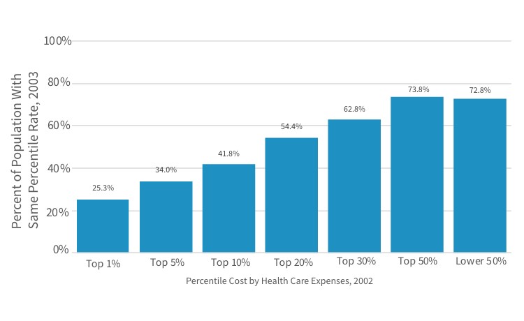
Sources: Center for Financing, Access, and Cost Trends, AHRQ, “Household Component of the Medical Expenditure Panel Survey,” HC-070 (2002), HC-079 (2003), and HC-080 (Panel 7), cited in S. B. Cohen and W. Yu, “The Persistence in the Level of Health Expenditures over Time: Estimates for the U.S. Population, 2002–2003,” Statistical Brief #124, AHRQ, May 2006, https://meps.ahrq.gov/data_files/publications/st124/stat124.pdf.
It’s not hard to piece together some anecdotal explanations of why this might be. For example, a successful transplant procedure would cause high costs in one year followed by relatively lower costs in the following year: a premature baby may require intense medical attention in the first weeks of life, but live a relatively healthy second year of life; a severe burn is unlikely to reoccur.
The distribution of per-member annual claim costs will stay about the same each year (all else being equal) despite this known regression. Most individuals in the top 20 percent in the first year will move below the top 20 percent in the second year, but the average costs of the top 20 percent collectively will be about the same in both years because individuals not in the top 20 percent in the first year will rise to that higher tier in equal number to the individuals initially in the higher tier who drop lower. In terms of the anecdotal examples, while the individual transplant patients vary from year to year, the total number of transplants in each year is consistent. Regression to the mean is as present in “high to low” as “low to high” situations: individuals with $0 costs have a propensity to have higher costs in the following year (their costs can’t go any lower!). The point is that the first observation is extreme, whichever direction that is.
The importance of considering regression to the mean varies for different applications and analyses. Thinking about how health care has changed in the 15 years since the AHRQ study gives some insight; specifically, how does the increased prevalence of very high cost treatments and the increased proportion of Americans with one and two or more chronic diseases impact the propensity of individuals in top tier costs to move to lower tiers in subsequent years?
When a distribution is very skewed (i.e., very extreme tail observations are possible), observations along that tail are close in terms of percentile and far apart in terms of absolute value. The height of adults is fairly symmetric (it is not skewed) while the heights of buildings are highly skewed. The 100th and 50th percentiles of male heights are roughly eight feet three inches and five feet nine inches, respectively[3],[4]—about a 30 percent drop. The 10th tallest building in the U.S. is similarly around 30 percent shorter than the tallest building,[5] but they are both in the 99.99th percentile of U.S. building heights. Regression to the mean could be a larger effect when dealing with data sets like the height of buildings because of the sensitivity of the tail.
Regression to the mean is also more dramatic when subsequent observations are uncorrelated to previous observations. The coin-flipping example was easy to understand because each flip is entirely uncorrelated; no matter how many heads are flipped in a row, the next series of flips will return to a mean (it never really left the mean). Increased chronic morbidity in health care can be a driver of more predictable and correlated high costs between years, compared to high costs due to accident or injury care, which do not as frequently repeat year to year. As chronic morbidity becomes more prevalent, the percentage of individuals in the top 1 percent who stay there will increase, and the regression to the mean effect will become less pronounced.
EXAMPLE: EMERGENCY ROOM CLINICAL UTILIZATION MANAGEMENT PROGRAM
A common clinical intervention may seek to lower emergency room utilization among high-utilizer populations through disease management and other proactive counseling methods.
An actuary’s first involvement in such a program might be helping the clinical teams figure out who to engage in the program shortly before intervention starts. A straightforward way to create that list is to find the high utilizers in the previous year.
Figure 2 shows a hypothetical scenario of emergency room (ER) visits for 10 members over two years. The clinical department tells the actuary they want to target the top 20 percent of utilizers, so using the 2020 data (the most recent year; 2021 has not happened yet), the actuary sends them members G and J, happy that in targeting the top 20 percent of members, 75 percent of annual ER visits are included.
Figure 2
Emergency Room Visits, 2020–2021 (Hypothetical)
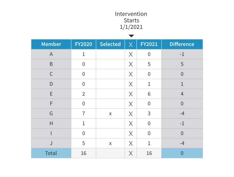
The program launches, 2021 data becomes available, and it shows the program is successful! Now asked to calculate savings, the actuary compares 2021 and 2020 utilization and it looks like the presence of the intervention in 2021 reduced ER visits from 12 to 4 for these members—a 67 percent reduction. Going into 2022 the actuary selects members B and E for inclusion in the program and builds in those 7.3 saved visits (11 visits x 67% reduction) into next year’s pricing and forecast.
But here the story can start to unravel. There were eight visits “saved” in 2021, but total ER visits was 16 in both years—in a holistic sense there was no change in ER utilization (forget, for the sake of example, that the reduction may have mitigated an otherwise present utilization trend).
And although the success of the program in 2021 made the actuary excited to select members B and E for 2022, a good question is how could the clinical program have intervened with B and E while it was still 2021, in the midst of their high-utilization events?
Even worse, while the seven and five ER visits from members G and J looked like outliers in 2020, seeing that member B could go from zero to five ER visits implies that these numbers jump around. Maybe member J’s drop from five visits to one is just the same kind of volatility at play, not an effect of the clinical program. The actuary does not have a way to adjudicate that claim in the current setup.
These three observations are all manifestations of regression to the mean, and not appropriately handling this effect is potentially leading the actuary to select the wrong members into the program and to overstate the effectiveness and savings generated by the intervention. The remainder of this article will cover ways to mitigate the impact of regression to the mean from these prospective and retrospective vantage points: How can an actuary provide assurance that the right members are included in the intervention and that the calculated savings are accurate?
PROSPECTIVE IDENTIFICATION AND MITIGATING REGRESSION TO THE MEAN
In the previous example, the actuary selected candidates for the program by looking only at prior ER utilization, implicitly assuming that ER visits in 2020 were highly correlated with ER visits in 2021. Regression to the mean suggests that assumption may not be correct. In fact, knowing that an individual had very high ER visits in 2020 could even suggest they will have relatively fewer visits in 2021—in a sense, they are exactly the wrong people to intervene with next year. The actuary may need to engage with the question “Who is likely to have high ER visits in 2021?” more directly.
There may be other information in 2020 that will shed light on 2021 ER visits that is buried in the data. For example, a member with a history of severe headaches switches medications several times, or a member with previously stable COPD shows signs of failing lung efficiency. Clinical expertise combined with predictive analytics can be a powerful tool in this environment, and health care actuaries are often uniquely suited to serve as an intermediary. Why? Health care actuaries often know enough of the clinical side from working in health care their whole careers (not necessarily true for other types of data practitioners), and actuaries’ technical and analytical skill set lends itself to understanding the predictive analytics side.
Knowledge of regression to the mean forces the actuary to be more intentional here. When asked in 2020 to identify members for intervention, the actuary should have gone back to 2019 data and assessed how accurate the identification method was by comparing to 2020 data. When the actuary then recommends members for intervention in 2021, there is confidence these are the optimal members to engage with.
The actuary could also help tune the assumption that Clinical should engage the top 20 percent of members. Using 2019 data, the actuary could see what happens if the top 5 percent, 10 percent, 20 percent or 30 percent are selected and use the 2020 data to construct a cost-benefit analysis. It may be, for example, that casting a wide net is helpful: The identification is not highly predictive but there is high value in capturing every possible high-utilizing member, and the costs of intervening with a member who will not be a high utilizer (a false positive) are small.
RETROSPECTIVE MEASUREMENT AND MITIGATING REGRESSION TO THE MEAN
In the ER example, the actuary may have significantly overstated the amount of savings resulting from the intervention. These members could have visited the ER fewer times in 2021 regardless of the intervention. There are three main categories of strategies that can provide clarity and ensure that the actuary is accurately measuring savings.
The first strategy leverages the prospective identification discussed earlier. If the analysis and validation of that model assures the actuary that the engaged members will have high ER visits in the following year, any decrease from the model’s expectation can appropriately be attributed to the program. Even when the model is not that good (health care data can be wily), this strategy allows the actuary to present the savings estimates with a range around them. Knowing a range with confidence can be better than being uncertain about a point estimate.
A second strategy is using a control group methodology. Control groups work well when everything between the control and intervention groups is the same except the one thing being measured. When using control groups to handle regression to the mean, there is no need to isolate the regression effect from other effects that might impact measurement because they are all embedded in the control group. This “catch-all” reality can prove a helpful simplifying assumption.
In Figure 3, the gray line represents the control group, which, due to regression to the mean, drops one unit. Because of the parity between the control group and the intervention group, regression to the mean can be backed out from the intervention group (and other extraneous effects that are being controlled for) to reveal that only two units from the three-unit change are a “true” effect.
Figure 3
Using a Control Group to Mitigate Regression to the Mean
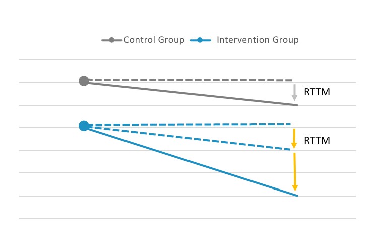
Abbreviation: RTTM, regression to the mean.
This kind of pristine control group setup is hard to come by in the real world due to volatility in data and small populations. Stratified control groups can be helpful to mitigate this difficulty. Rather than using randomization to achieve similarity between the control and intervention groups, similarity between the two groups can be explicitly enforced by controlling for all the things that can be measured. Often called “propensity matching” or “matched cohort analysis,” this method can allow for similarity without the need for very large sample sizes. This can be even more important because of the desire to apply helpful interventions as widely as possible; excluding members from the intervention solely for the sake of a clean control group can be a steep price.
A variant of the control group method is treating data just below a cutoff point as the control group. For example, if the top 5 percent members are eligible for an intervention, members in the 6–10 percent range are the control group. This method does not artificially limit the scope of the program (all eligible members received the intervention) and still isolates the regression to the mean effect in the non-intervened population. It is important to ensure that regression to the mean works similarly for the populations above and below the cutoff; because it is inherently a tail-based phenomenon, moving away from the tail can have dramatic effects.
A third strategy is using historical data to construct a synthetic control group to calculate the regression to the mean effect for application to current data. In the ER example, when the actuary used 2019 data to predict 2020 ER visits to assess the accuracy of the identification model, the actuary could also quantify any regression to the mean effects embedded in that identification method. Knowing the expected impact of regression to the mean, the actuary can back out the regression to the mean effect measuring savings in 2021. The downside of this method is that it requires the actuary to look back to historical data, when there were no intervention effects, which becomes more difficult as time goes on. If the ER program undergoes material changes in the fourth year of the program, for example, the regression to the mean assumptions need to be recalibrated using five-year-old data, which can introduce new difficulties.
CONCLUSION
Regression to the mean is a ubiquitous phenomenon. In this article, an ER clinical intervention was used as an example, but regression to the mean can be present in any sequential data set used to compare one period to the next. That means regression to the mean can be a concern in macro-level health care cost and utilization trends, broader economic trends (unemployment, stock market prices, etc.), the weather and even global events (a return to all sorts of means would be a welcome outcome in 2021). Health care actuaries need to understand and be able to mitigate the effects of regression to the mean to avoid misapplying predictive models or misstating measurements of historical effects.
Tony Pistilli, FSA, MAAA, CERA, is director of Actuarial Services and Analytics with Optum Insight’s Payment Integrity product. He can be reached at anthony.pistilli@optum.com.