
Unpacking Predictive Analytics for the Long-Term Care Insurance Industry: How New Approaches to Model Visualization Can Support Greater Understanding of Results
By Mike Bergerson, Missy Gordon, John Hebig and Joe Long
Long-Term Care News, February 2021

The long-term care (LTC) insurance industry has shown significant interest in the use of predictive analytics to develop more accurate projection assumptions for the purposes of reserving, rating, and valuation. These techniques avoid some of the disadvantages of traditional actual-to-expected (A:E) experience studies, which we have discussed in a series of articles that we previously published.[1], [2], [3] In this article, as a refresher, we’ll first summarize key points from those articles. We will then dive into new model visualization approaches we use to shed light on the “black-box” nature of advanced modeling techniques. These visualizations help us better highlight and understand the key drivers of predictions so that they can be understood and validated by all stakeholders.
Refresher on Using Predictive Analytics for LTC Experience Studies
When using a traditional A:E approach, actuaries must adjust industry benchmarks by developing credibility weighted adjustments based on the company’s experience. This helps ensure projection assumptions will generalize well to future experience by not over fitting assumptions to the company’s historical experience. Determining the credibility of data is a theoretical and judgment-based exercise requiring input from the actuary and is therefore subject to bias. More significantly, a traditional A:E approach is also a manual process that places practical limits on the number of variables and interactions that can be considered.
Predictive analytic techniques, such as a penalized generalized linear model (GLM), can balance the bias/variance tradeoff (weight given to the experience) using an automated approach that better informs actuarial judgment. The weight given to a company’s historical experience is determined through a data driven process that tests a range of data weights and chooses the one that minimizes deviations between unseen experience (data not used in the development of the assumption) and the projection assumption. Another predictive analytics technique, the gradient boosting machine (GBM), takes automation one step further by exploring interactions among model variables without the need for explicit user input.
These techniques enable LTC actuaries to produce robust projection assumptions without requiring extensive manual work.
Black-Box Nature of Advanced Models
One of the key challenges in using these predictive analytic techniques for assumption development from a practical perspective is that the adjustments are not as easy to isolate and understand when compared to assumptions derived from traditional A:E studies—even though the results might be more defensible and robust from a statistical perspective.
For example, a GBM model uses decision trees to make predictions. If the final model was a single decision tree, it would be easy to understand what is driving the predictions. It would appear as a neat map of yes-or-no questions that could be followed to the result.
However, real GBM models may contain hundreds or thousands of trees, making it difficult or impossible to comprehend them. Management who are accustomed to seeing the relatively straightforward interpretations common to traditional A:E studies may find the results of complex models opaque. This can lead to concerns that predictive models are “black boxes” that do not provide sufficient transparency about how assumptions were derived. It can be difficult to see how a given variable impacts the overall adjustment applied to a given cell in the data (or benchmark), or to understand its interaction with other variables.
One approach to gain comfort with the assumptions produced by predictive analytic techniques is to express the results in A:E tables. Even though adjustments made using predictive models can be challenging to express as A:E factors, one can look at the A:E fit for various characteristics to help ensure the model is not under or overfitting the company’s historical experience. This conveys information related to the derived assumptions in a manner similar to traditional A:E studies that actuaries and management are comfortable with and have been using for years.
Techniques to Open Up the Black-Box
Today, advances in cloud computing, combined with well-developed techniques for analyzing and exploring variable interactions in predictive models, provide new and intuitive options for visualizing the results of complex predictive models. By employing these techniques, organizations can use the latest analytical approaches and empower decision makers with information that is easy to understand and respond to. This not only helps remove skepticism around the results of these models, but also makes those results more useful for a wider range of audiences by providing clarity around the strength and characteristics of variable interactions.
One such analytical technique that enables exploration of complex models is known as Shapley additive explanations, or SHAP values. The theory was introduced by game theorist and mathematician Lloyd Shapley in the 1950s and in 2017 was applied to machine learning by Scott Lundberg and Su-In Lee.[4] It enables one to calculate the contribution that each feature (variable) has on the model’s expected output. In other words, it shows how variables drive predictions—which is exactly the information we need to interpret the results of a machine-learning model. Calculating SHAP values is computationally nontrivial, which makes the approach difficult to apply in a generalized fashion to complex models. Today, because of the advent of cloud computing, it can be accomplished in a reasonable time without needing to own your own supercomputer.
Applied Visualizations and Interpretations
To highlight the applications of SHAP values to visualize the results, we performed an LTC claim incidence experience study for a single company that has granted us permission to share high-level results.
When performing a study like this, we typically use an industry benchmark such as the Milliman Long-Term Care Guidelines as the starting expectation. We then use advanced models (e.g., penalized GLMs or GBMs) to develop credibility blended adjustments based on the company’s historical experience. However, for simplicity and illustrative purposes for this article, we used a GBM that adjusts a claim incidence assumption that only varies by attained age. We then investigate the reasonableness of adjustments made to the starting expectation by calculating SHAP values for each observation in the underlying data used to train the GBM.
There are several ways to apply SHAP values when evaluating assumptions derived using predictive analytics for LTC insurance. The most basic approach is to look at SHAP values for a single observation, which shows how each feature (variable) in the model contributes to the final prediction for that given observation. One common approach for introducing SHAP values to someone unfamiliar with the topic is to create a SHAP waterfall chart. In this case, the waterfall shows the movement from the starting expectation to the final adjusted assumption for a single policyholder.
Figure 1
A SHAP waterfall graph for an individual policyholder
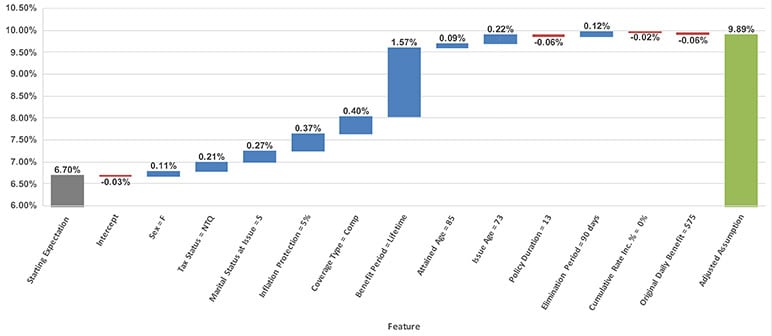
In Figure 1, the SHAP waterfall graph shows how the starting expectation for an 85-year-old (attained age 85) is adjusted by the model to arrive at the adjusted assumption. As we can see, the biggest driver of change is due to the policyholder purchasing a policy with a lifetime benefit period. One rationale for this increase can be attributed to the policyholder having no need to conserve benefits with a lifetime benefit period so they are more likely to file a claim compared to a policyholder with non-lifetime benefits.
One important attribute about SHAP values is that they provide a local explanation of what is driving an individual prediction rather than a global explanation. In other words, SHAP values for a given feature in our example will vary across observations (i.e., policyholders) and are dependent on the characteristics of an individual policyholder. Therefore, looking at one SHAP waterfall example does not paint the entire picture of the adjustments that are applied by the model.
To dig into this further, we can aggregate the SHAP values across all observations in the training data to create a feature importance graph. In the setting of an experience study, this graph provides a high-level illustration of how much each variable contributes to the overall adjustments that are applied to the starting expectation. It represents an average magnitude of the adjustments (mean(|SHAP value|)) for the entire cohort of policies being studied, which can be normalized on a percentage scale that adds up to 100 percent.
Figure 2
A SHAP feature importance graph scaled to 100 percent. It shows the percentage of total contributions a feature (variable) provides to the model’s predictions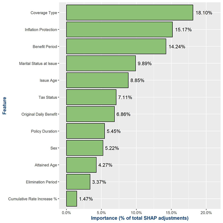
Figure 2 is a SHAP feature importance graph from this analysis, which shows the relative importance that the features have at adjusting the underlying starting expectation (i.e., what is missing from the starting expectation). In this case, the coverage type a policyholder purchased contributes most to the adjustments on average. This illustrates the importance of investigating the SHAP values across the entire training data, as if we only looked at the single waterfall example in Figure 1, then we would have inferred that benefit period attributed most to the adjustments.
When reviewing feature importance graphs, or SHAP values in general, it’s important to keep in mind if there is any correlation between variables in the model (i.e., multicollinearity), as SHAP contributions across colinear variables can be hard to tease apart.
In a GBM, the contribution that each variable makes to the final prediction (or adjustment) can vary by policyholder and is dependent on the policy characteristics applicable to a given individual. For example, Figure 1 illustrates the adjustment for single given that the individual is 85 years old, but this adjustment for single may differ for a 70-year-old, which means there is a distribution of adjustments for a given variable.
The next level of detail is to use a SHAP graph to understand the distribution of adjustments underlying a given variable. This is useful when needing to dig deeper and review the appropriateness of adjustments applicable to different levels within a variable.
SHAP distribution graphs can be used to provide an illustrative summary of how a given variable’s adjustments vary across the policy data set. The shapes of these distributions can provide insight into the pattern of adjustments specific to the variable.
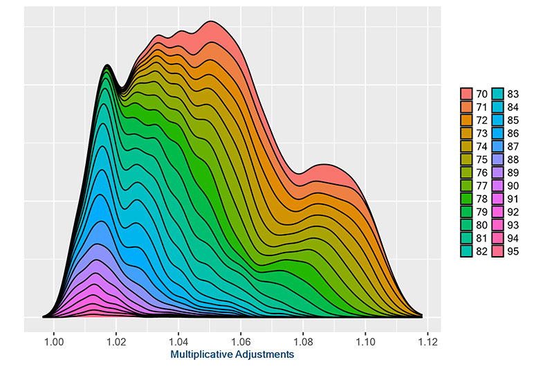
Figure 3
SHAP graph showing distribution of adjustments for by marital status at issue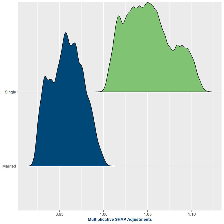
Figure 3 provides the distribution of adjustments, being applied to the underlying claim incidence assumption, based on marital status (married at issue versus single at issue). The y-axis represents the count of observations (density) receiving an adjustment of a given magnitude, which is identified on the x-axis. The x-axis is shown as multiplicative adjustment, as we used a GBM model that allows us to transform SHAP values into multiplicative adjustments that get applied to the starting expectation. The adjustments for marrieds are clustered around 0.95, while adjustments for singles are spread more widely but range from 1.00 to 1.12—a wider dispersion than marrieds. From this graph, one can see that the predictive model is confirming the preconceived assumption that married insureds will incur lower claims in the future than their single counterparts, which was not captured in the underlying expected basis.
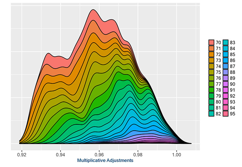
Taking a step further, we can use SHAP graphs that include interactions with a secondary variable. For example, we could examine the interactions between adjustments to marital status at issue relative to attained age. This could show one of three things. First, we might learn that there is no correlation between adjustments to marital status at issue and attained age, in which case the SHAP graph with interaction would appear uniform across attained ages. Second, it might show that increasing age magnifies the martial status at issue adjustment. Or, finally, it could be that marital status at issue adjustments decrease with increasing age.
To apply this approach to the previous example of married versus single policyholders, we can enhance the SHAP graphs to show the interaction of the marital status at issue variables with each of the other variables included in the model. This type of bulk analysis is where having cloud computing resources comes in handy, allowing us to get results for the entire universe of variables in just a few minutes as opposed to hours or days. Then, an actuary can look at the visualizations to determine whether interesting patterns appear, indicating potential correlations and/or interactions between the two variables. However, even though we can easily produce graphs of all the pairwise interactions, it still takes time to review them. Therefore, it is important to run a separate feature interaction importance analysis and use it as a guide for which interactions you should spend your time exploring.
Figure 4
SHAP Graphs with interaction showing the interaction between marital status at issue and attained age
Married at issue policyholders
Single at issue policyholders
The examples in Figure 4 show clear patterns that could be of interest to decision makers. The increased distribution of older attained ages closer to 1.00 for both married and single policyholders shows that the effect of marital status tends to wear off as they attain higher ages. One could hypothesize that this is because marital status is gathered at the time of underwriting, and marital status may change significantly in the population without changing in the data set.
It is also important to review the SHAP graphs for relationships that are counter to one’s intuitions, which may indicate potential data issues or variables being unintended proxies (e.g., tax status being a proxy for issue era if the different policy types were not sold at the same era). If an unexpected relationship is found, a variable can be dropped or engineered into a new feature to help smooth the adjustments the model makes.
Closing Remarks
Tools like SHAP values can help actuaries gain comfort in using “black-box” modeling algorithms, such as GBMs. In fact, they show us that these “black-box” models are really not black boxes at all. As we have shown, we can use tools like SHAP values to investigate the drivers of models in a variety of ways, which includes nice visual graphs.
These graphs allow us to gain a much better understanding of not only the adjustments being derived by the predictive model, but also why the adjustments are being made. Especially when using the colorful SHAP graphs with interactions, the graphs provide a concise way to review the resulting assumption adjustments in relation to the starting expectation. This fits in with existing approaches to evaluating modeling procedures and makes it easier to use predictive models throughout the organization for audiences composed of both actuaries and non-actuaries.
We also mentioned that calculating SHAP values is a computationally intensive task that we sped up by using cloud computing. This should not discourage organizations from running this type of analysis if they are hesitant due to the associated cost of using cloud resources. The entire analysis we outlined in this article cost less than $25 of cloud computing charges. However, one also must consider the cost of administrating a secure cloud computing environment and developing and maintaining the code to run the analysis.
With techniques such as those outlined in this article, actuaries can allow the machines to do the heavy lifting, leaving more time to review, interpret, and apply actuarial judgment to the results.
Statements of fact and opinions expressed herein are those of the individual authors and are not necessarily those of the Society of Actuaries, the editors, or the respective authors’ employers.
Mike Bergerson, FSA, MAAA, is a principal and consulting actuary at Milliman. He can be reached at mike.bergerson@milliman.com.
Missy Gordon, FSA, MAAA, is a principal and consulting actuary at Milliman. She can be reached at missy.gordon@milliman.com.
John Hebig, FSA, MAAA, is a consulting actuary at Milliman. He can be reached at john.hebig@milliman.com.
Joe Long, ASA, MAAA, is a senior actuarial data scientist at Milliman. He can be reached at joe.long@milliman.com.