
Harnessing BI Tools for In-force Metrics and KPIs
By Angela Garcia
Product Matters!, February 2024

In the actuarial profession, we excel (pun intended) at handling the intricacies of data, with many of us already making the leap to SQL for data processing and storage and VBA for automation. Yet for visualizing, slicing, and interpreting data, Excel often remains our primary tool. We can create dashboards that monitor our preferred key performance indicators (KPIs), but often these can be static and high-level. How do you ask the right questions, identify areas of opportunity or weakness, and determine how deep you must go to drive strategic decision-making? How often can you afford to do all this work when someone wants a deep dive? Or better yet, how can we empower non-technical users to explore and answer their own questions? This is where Business Intelligence (BI) tools such as Power BI, Tableau and others come into the picture.
BI Tool Advantages
- Real-Time Updates: Integrating with a centralized data warehouse enables BI dashboards to automatically extract and refresh data. This seamless update extends to all tables and visualizations, ensuring users always see the most recent information.
- Automatic Data Processing:Several BI tools have functionality in which they can automate data processing steps every time data is imported. This functionality spans tasks such as altering data types, appending data, and modifying columns, filtering, and combining fields.
- The Data Model: BI tools allow users to define associations across tables and data fields, akin to joins in a database. The platform can automatically verify the integrity of these associations, ensuring that they are correctly specified, and continuity errors are minimized. Other tools such as Tableau allow for both joins and relationships between fields, which can allow for more flexibility and intelligent aggregation when dealing with data that may contain duplicate records within the fields of both tables.
- Visual Drag-and-Drop Interface: After setting up relationships/joins and defining necessary formulas or aggregator functions, users can leverage various pre-built visuals for data analysis. Building visuals can be as intuitive as dragging and dropping fields, not unlike a pivot table, but much more dynamic and versatile.
- Filtering and Drill-Down Capabilities: Different filtering features within BI tools offer a streamlined approach to segmenting data, whether for a particular visual, dashboard page, or on a report-wide basis. These have different nomenclature in different tools; however, principles are similar across platforms. Slicers (using Power BI terminology) offer an interactive way for users to customize the content they want to focus on (e.g., a slider bar that allows you to select date ranges). Filters can operate in the background, such as filtering out smaller lines of business from the front-end to remove noise in how the data is presented.
- Deployable: Many BI tools can be integrated with company gateways and servers or are deployable by other means. This allows for user-facing, read-only versions of tools, with access regulated by login credentials. Stakeholders can thus access insights in real-time and query data at their convenience.
Figure 1
An Example of a BI Software Data Model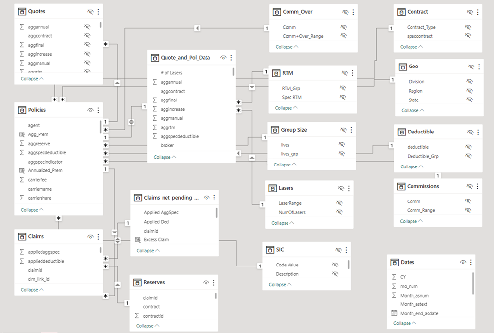
Implementation Considerations
BI solutions offer numerous benefits, though are not without a learning curve. For example, working with DAX—the syntax Power BI relies on—can be daunting. Many consider it easy to learn, but difficult to master. Fortunately, the bulk of this complexity rests with the developer. Once reports are set up, the front-end experience remains intuitive for users. Consistent (both in structure as well as frequency) data extracts are also required to get the most out of the tool. Finally, organizations need to consider stakeholder access. The most controllable method, in that only the user-interface front-end is accessible to most users, typically involves deployment on a company portal or server. This can facilitate access for both internal and external users, however it will likely require coordination with IT resources. Despite these hurdles, once you or your team becomes “first mover” on utilizing BI tools in your reporting, the value proposition quickly becomes clear, and others will likely begin to look for additional ways to implement this technology across your organization.
Clearly, different stakeholders will have specific KPIs they want to focus on, so you will need to align your dashboard or tool to the appropriate audience. Underwriters assess risks tied to policies, ensuring appropriate pricing and coverage. Sales representatives focus on growth and production, pinpointing areas ripe for opportunity. Meanwhile, management relies on KPIs to oversee business health and steer strategic choices. The following sections delve into three different company case studies each with unique needs: a segmentation tool, a group-level historical performance summary, and a growth and production dashboard. While these are all examples from employer stop loss business, similar challenges and solutions could apply to many other lines of business.
Examples
Loss Ratio Segmentation
- The Challenge: An Employer Stop Loss carrier wanted a deeper understanding of their business performance across various segmentations: from high-level line-of-business to more nuanced rating criteria such as deductible group size, area, industry, and contract type.
- The KPIs: The focus was on gross and net loss ratios. While gross loss ratio is a standard claim-to-premium ratio, the net loss ratio encompasses expenses, reinsurance premiums and recoveries, and is a comprehensive metric of retained risk and profitability.
- The BI Solution: An interactive tool that allowed for multiple segmentations of loss ratios. One key advantage to moving away from Excel and into a BI tool in this situation was the ability to drill down as deep as you wanted. With a few clicks, you could see experience for manufacturing groups located in Texas with deductibles between $100–200K. You could also display how much premium volume and number of groups fell into each segmentation to avoid drawing conclusions from non-credible experience.
- The Impact: This analysis helped validate that the carrier’s underwriting decisions made in the past had the desired effect on future business, as well as identify future watch items or areas where pricing may need to be adjusted or additional risk mitigation put in place. It also facilitated optimized risk selection, enabling the company to target profitable market segments while managing exposure to adverse claims experience.
Figure 2
Segmentation Tool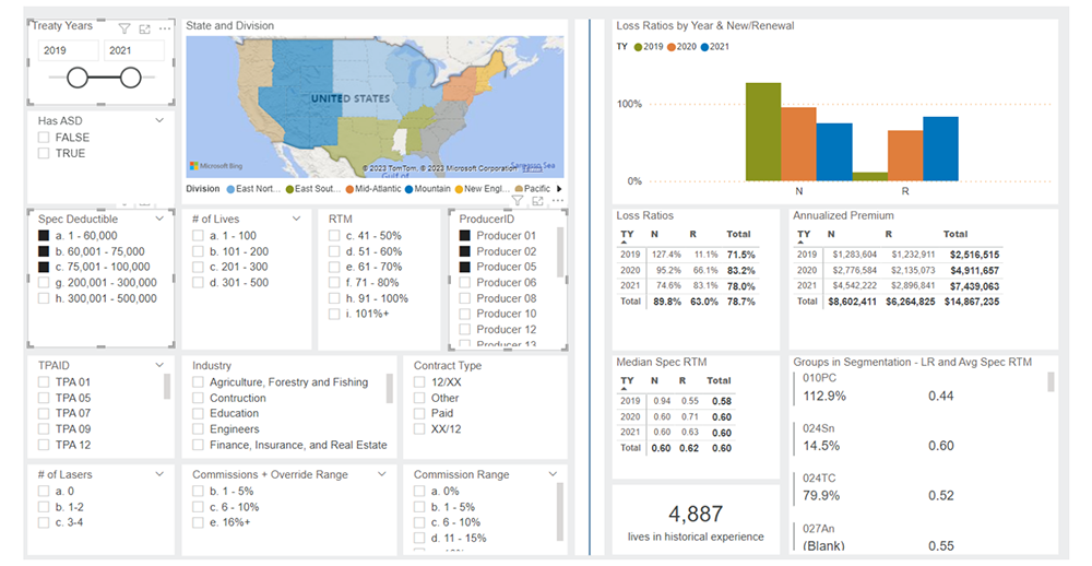
Group Historical Performance
- The Challenge: An underwriting team needed swift, data-backed insights to evaluate their renewal book, determine rate increments, and rank groups. They desired a tool that could trace employer group experiences over multiple plan years, highlighting key plan design or additional features, rate histories, and potential improvement avenues on experience and pricing.
- The KPIs: While loss ratios were the primary measure of profitability for a group, other components were considered as well: claims frequency and severity per life, pricing rate-to-manual factors, and historical rate increases could all be indications of the overall state of the group.
- The BI Solution: An interactive, user-friendly tool that would allow external parties to derive answers without relying solely on the actuary. This "self-service" model allowed underwriters to quickly access insights and delve deeper into data, seeking competitive edges or identifying risks, and provided a single, easy-to-access source of information for all historical data and characteristics of a selected group.
- The Impact: This proved to be a valuable tool during peak sales season when resources were maximized toward writing new and renewal business. It helped the underwriters waste less time tracking down disparate data on renewal groups and facilitated discussion across teams. One example success was a renewal group with consistently high claims over four years, despite rate hikes and lasering. The BI dashboard provided immediate insights, enabling underwriters to confidently propose and justify a higher rate increase to their sales team, as well as develop other ideas for improving the experience of the group.
Growth Metrics
- The Challenge: A start-up with 2–3 years of experience was looking to understand how their sales were tracking to their original pro forma sales projections. They knew close ratios were low in certain segments, but they weren’t sure of the extent this could be tied to COVID-19 impacts or something else. They were looking to pinpoint root causes and identify opportunities for improvement.
- The KPIs: These included submissions (potential policies under evaluation), quotes (firm proposals to prospective clients), sales, declines (unsold policies) and various ratios thereof. Monitoring these metrics shed light on marketing success, competitive positioning in underwriting and overall market demand.
- The BI Solution: Build a means to monitor sales and submission volume by different segmentations, such as brokerage, distribution and geography. This included various ratios such as submission-to-close, quote-to-close and decline percentages.
- The Impact: Based on the results from the tool, no clear relationship within production could be established between years impacted by COVID-19 and those not. As it turned out, the start-up's low close ratio wasn't a result of insufficient production stifled by the pandemic. Instead, it was the overwhelming number of submissions and the limited bandwidth of their underwriters that was affecting performance. Armed with these insights, the start-up refined its strategy by zeroing in on specific distribution avenues and regions. This data-driven approach optimized their resources, elevated their close ratio, and ensured a consistent influx of profitable business.
Figure 3
Sample Production Dashboard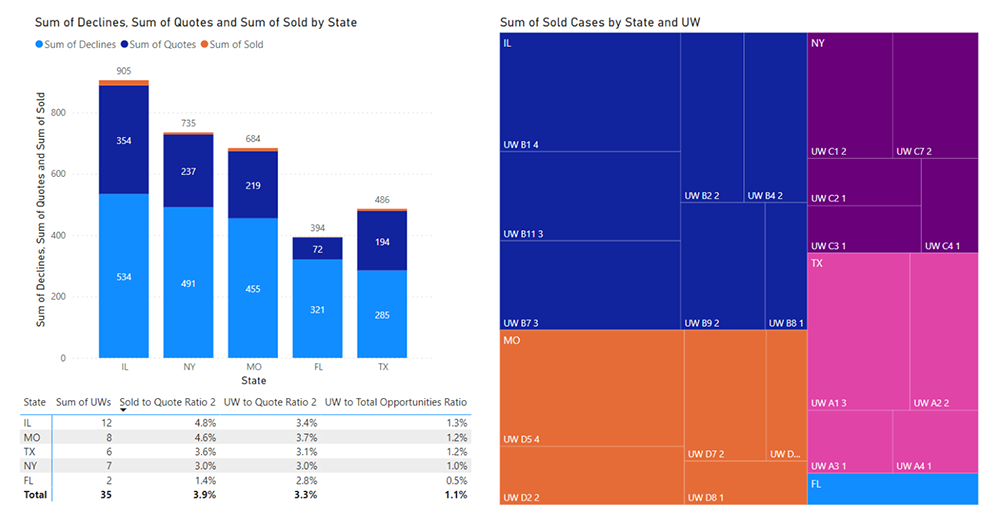
Looking Ahead
The effective monitoring of in-force policies through KPIs is imperative. The case studies presented—be it diving deep into loss ratio segmentations, tracing employer group performance, or optimizing growth strategies for a start-up—underscore the transformative power of tools with BI capabilities. These innovations empower us to surpass traditional methodologies, fully leveraging the depth of our data, and presenting it in a manner that resonates with both specialists and generalists.
The rise of data visualization has paralleled the explosion of big data in recent years. However, with the surge in generative AI technologies and user-centric predictive modeling tools, the urgency of "adapt or perish" becomes even more pronounced. We stand at the precipice of a digital metamorphosis. By thoughtfully embracing change and innovation, we’re ushering in an era where risks are mapped with precision, strategies are data-backed, and decision-making becomes an art form, informed by insights that were once obscured by limitations.
Actuaries have always been pivotal in shaping the insurance industry. With the powerful combination of expertise and cutting-edge tools at our disposal, we're not merely contributors but pioneers. It's an exciting juncture, and as we embrace these advancements, we pave the way for an insurance landscape that's as dynamic, informed, and visionary as the professionals who drive it.
Statements of fact and opinions expressed herein are those of the individual authors and are not necessarily those of the Society of Actuaries, the editors, or the respective authors’ employers.
Angela K. Garcia, FSA, CERA, MAAA is a Vice President & Actuary in the Life, Accident and Health segment of Gallagher Re. She can be reached at angela_garcia@gallagherre.com